Mobile Menu

Menu
- Rruga B, Prishtinë
- +38349133000
- info@hoxmedia.net
Packaging that sells the product before it is opened.
Bold. Clear. Shelf ready.
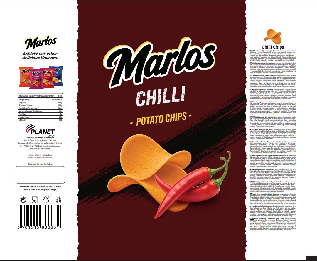
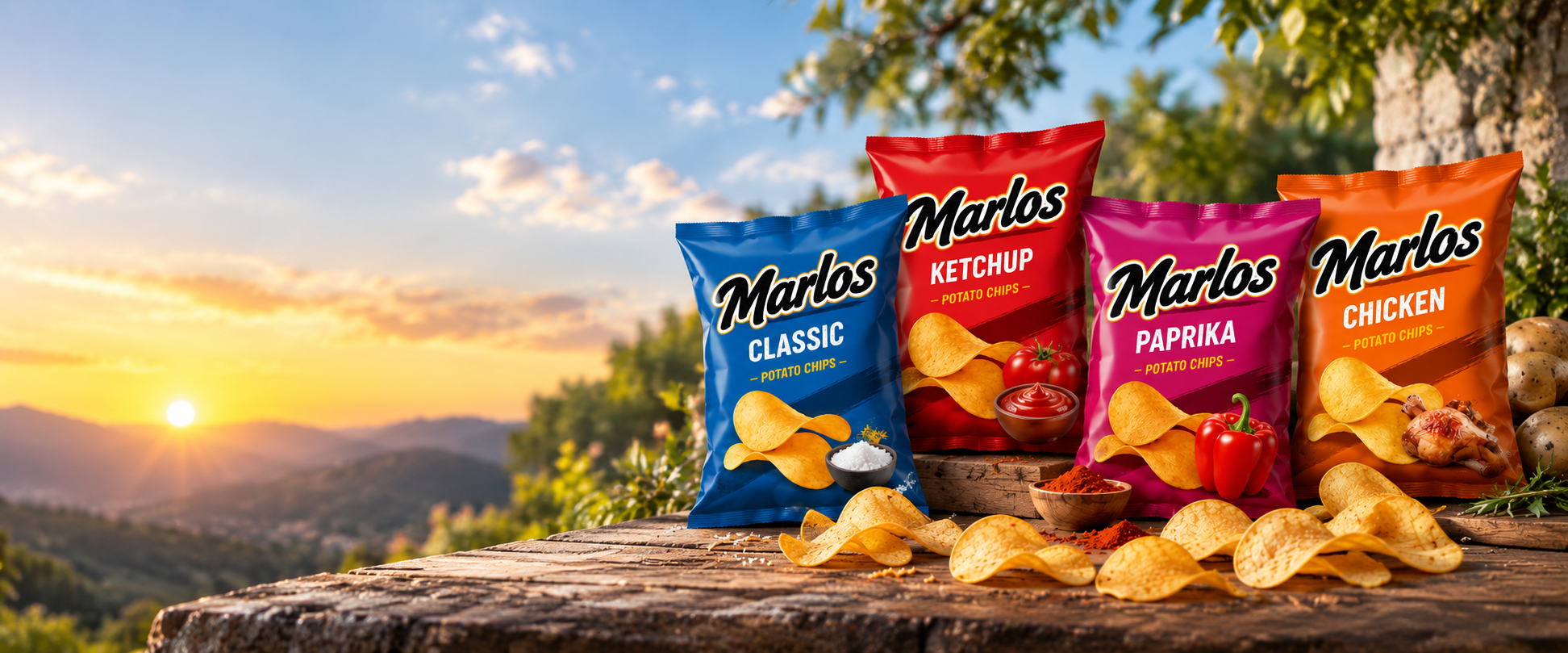
Marlos needed four flavours of the same chip to read as one family on a shelf crowded with other brands, each pack still clear at a glance about which flavour it actually is. A generic bag with a sticker for the flavour name would have blended in rather than stood out.
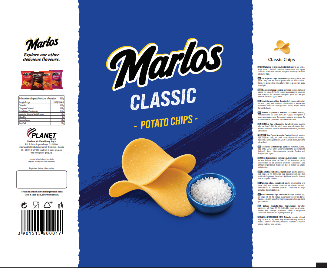
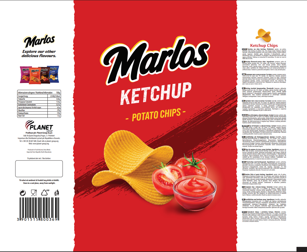
One base structure, the Marlos wordmark, the diagonal brushstroke, the chip and salt bowl shot, repeated across all four packs, with only the colour and the hero ingredient changing, blue and salt for Classic, red and tomato for Ketchup, magenta and pepper for Paprika, orange and chicken for Chicken.
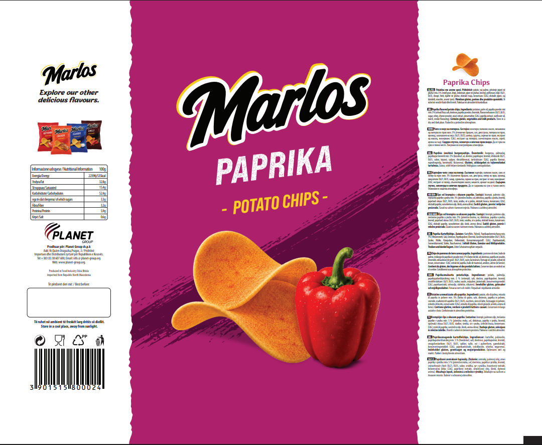
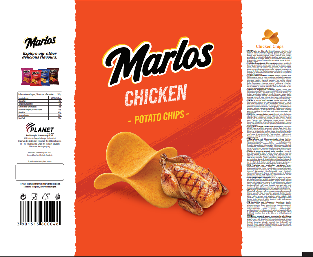
Four bags that read as one range from three metres away and as four distinct flavours from arm's length. A shopper who liked one Marlos flavour can spot the rest of the family without reading a word.