Mobile Menu

Menu
- Rruga B, Prishtinë
- +38349133000
- info@hoxmedia.net
Packaging that sells the product before it is opened.
Bold. Clear. Shelf ready.
Prima Gusto's three olive flavours shared one pale, near identical label, so a shopper scanning the shelf had to read the small print to tell green from black from green with pepper. The design did nothing to help a returning customer find their flavour again.
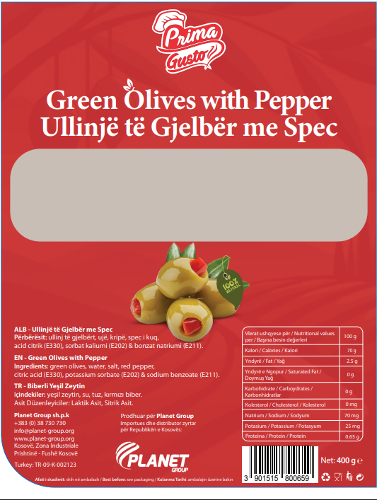
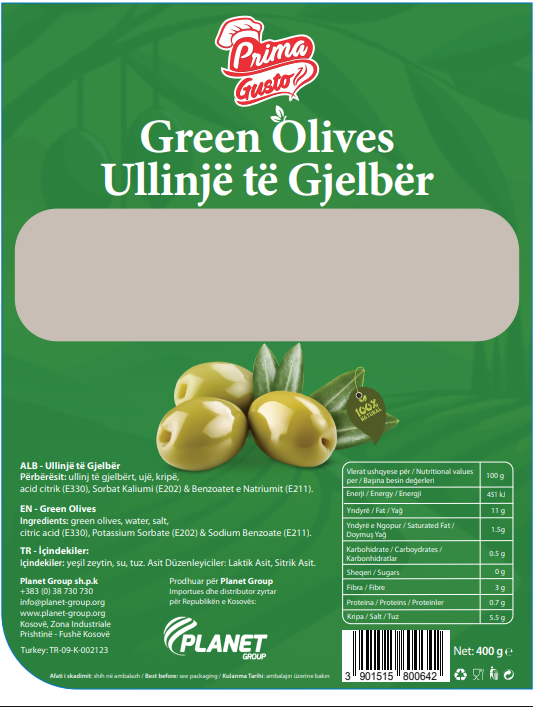
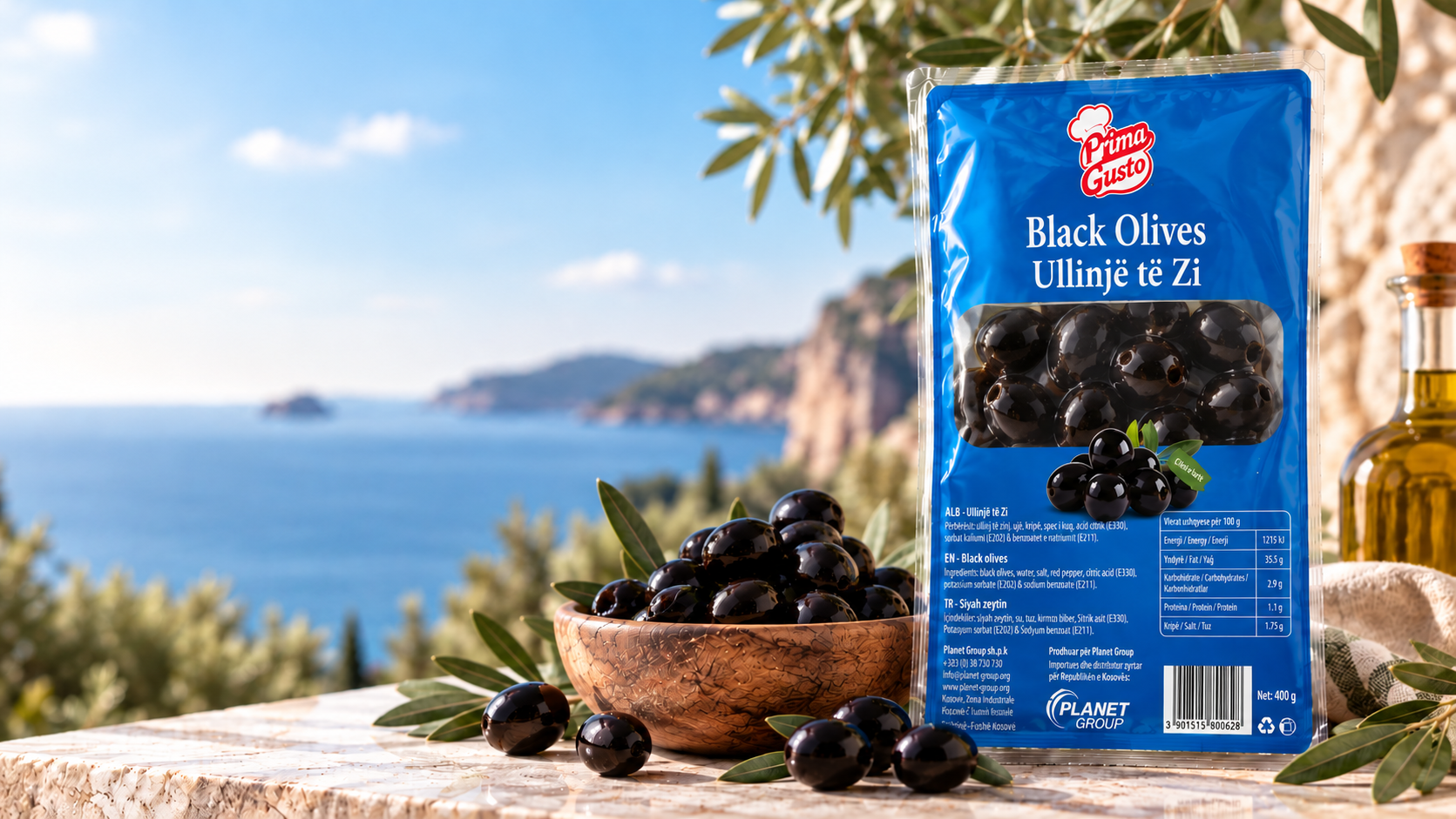
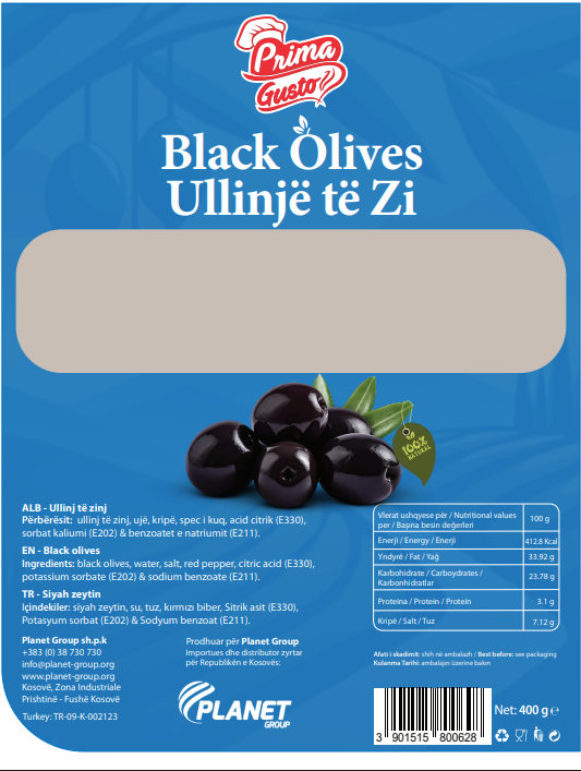
Each flavour got its own solid colour instead of a shared pale background, red for the pepper variety, green for plain green olives, blue for black olives, with the same Prima Gusto crest and olive photograph carried across all three so the range still reads as one family.
Three jars that announce their flavour before a shopper reads a word, and still sit together as one recognisable range on the shelf. A repeat customer finds their jar by colour alone, not by checking the label twice.